A digital studio identity,
applied at the door.
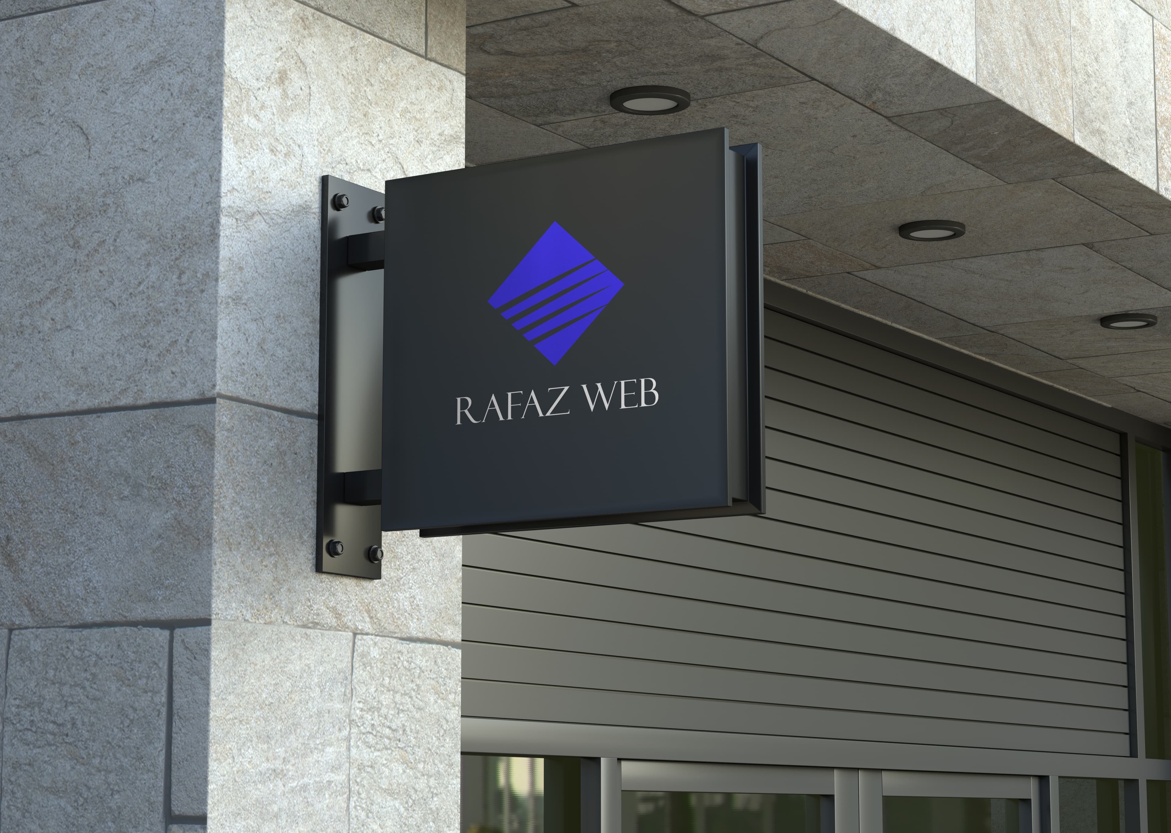
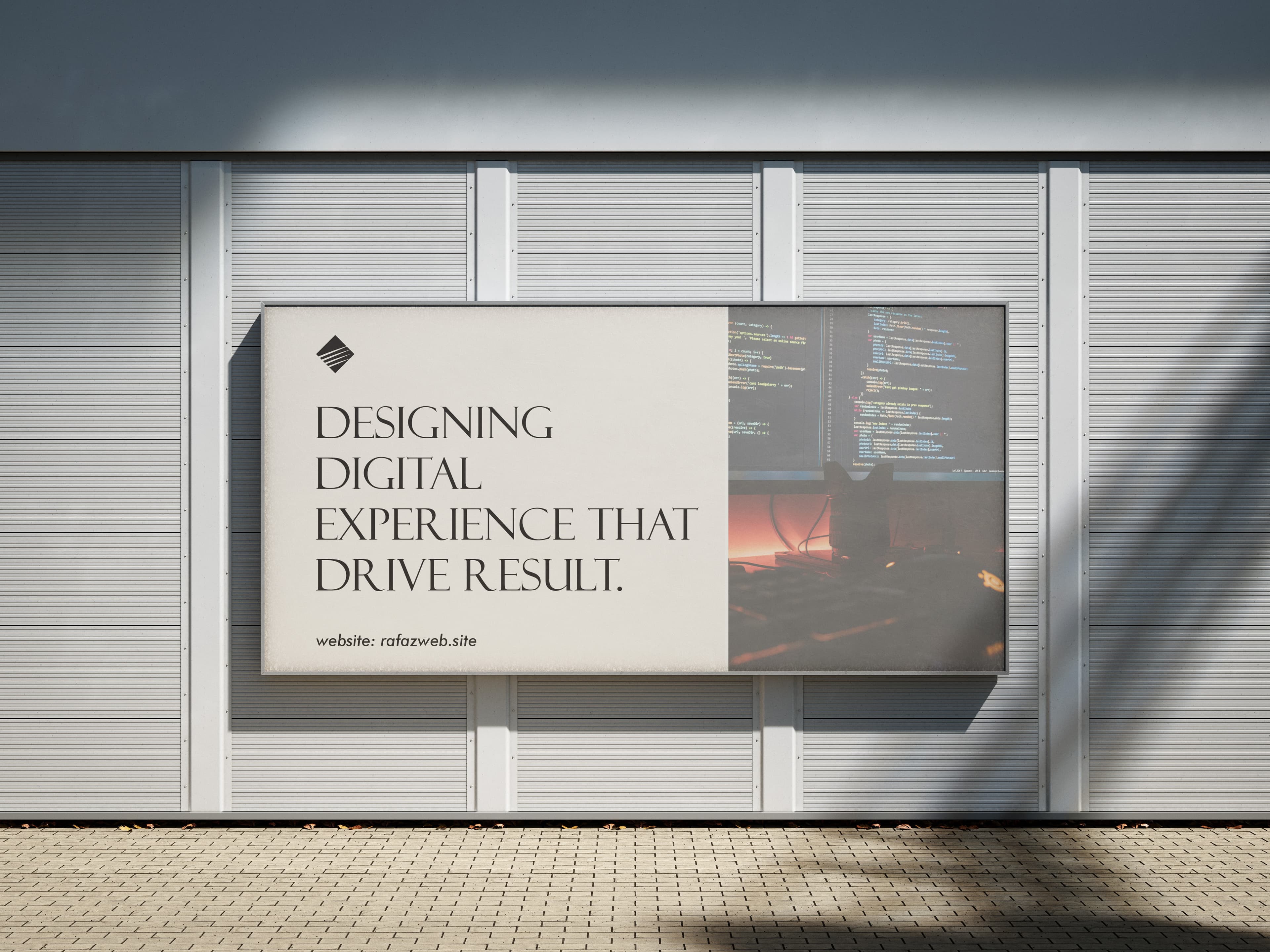
Brand and website for a Kano-based digital studio — drawn so the wordmark works on a glass storefront, on a header, and inside a 32-pixel favicon without redrawing it three times.
Where the project started.
Rafaz Web had outgrown a logo a friend made in college. They needed an identity that would hold up at the storefront and on a marketing site, and a site that explained the practice clearly enough to convert without a sales call.
Constraint: keep it small. One studio shouldn't look bigger than it is.
How we worked through it.
We drew the wordmark first for signage and worked backward to small applications — the opposite of how most identities go. The result is a mark that survives at fifty meters and at favicon size without bespoke variants.
The site itself runs on Next.js with content in MDX, so the team can update copy without us. Pages are intentionally short. We removed two of the original five sections during the writing pass; nothing was missed.
It looks like us. We don't have to apologize for the website anymore.
What changed after launch.
Storefront went live the same week as the new site. Inbound inquiries doubled in the first quarter post-launch, and the team reports they spend less time explaining what they do on first calls.
Measured.
Inbound inquiry rate in the quarter following launch, against the previous quarter.
Reported reduction in first-call explanation time.
Studio facts.
- Services
- Creative Design · Web & App Development · Brand Strategy
- Timeline
- 10 weeks
- Year
- 2024
- Team
- Studio of one + production print partner
Have something you're working on?
We take on a small number of new projects each quarter. If you're early, that's the right time to talk.